![]()
How I Design Social Media Posts That Look Clean and Professional
When you scroll through Instagram or LinkedIn, you can feel it instantly:
some posts just look clean and professional… and others feel noisy, messy, and cheap.
For me, this wasn’t an accident.
I started getting interested in graphic design back in 2012 during school. I didn’t even know the word “layout” properly, but I was obsessed with making class posters, event banners, and random designs look “nice and balanced.”
During my bachelor’s, I turned that interest into a side hustle, doing design projects while studying. In 2018, I officially started freelancing – designing for clients, brands, and content creators.
Over time, I realized something important:
Clean and professional social media posts are not about fancy designs.
They’re about clarity, hierarchy, and consistency.
In this blog, I’ll show you exactly how I design social media posts so they look clean and professional – step by step, the way I actually work.
1. I Start With One Simple Question: “What’s the Point?”
Before I open any design tool, I ask:
“What is this post trying to do?”
Because a post that tries to do everything usually ends up looking messy.
Some common purposes I design for:
- Promote a new video
- Announce a sale or offer
- Share a quote or short tip
- Introduce a service
- Build brand awareness (simple logo + tagline)
Once I know the purpose, I decide one main thing I want people to remember.
Example:
- Not: “New video, my story, my journey, please like share subscribe”
- But: “New video is live – Watch now”
That “one thing” becomes the main focus of my design. Everything else is secondary.
2. Message First, Design Second
This is where many people go wrong. They open Canva/Photoshop and start dragging shapes, gradients, and icons…
Then at the end they ask: “What text should I add?”
I do the opposite.
My process:
- Write the text first – short and clear:
- Main headline
- Optional subline
- Small call-to-action (CTA)
- Then I ask: “Can someone understand this in 2 seconds while scrolling?”
If the text is too long or confusing, I cut it before designing.
Example structure I like for posts:
- Headline: “Secure Your Instagram in 5 Minutes”
- Subline: “Simple steps anyone can follow”
- CTA (small): “Swipe →” or “Watch full video”
When the message is clear, designing around it becomes much easier – and the final post looks cleaner, because there’s no unnecessary text.
3. Visual Hierarchy: Who Is the Boss of the Design?
Every clean design has visual hierarchy – some elements are louder, some are quiet.
I usually decide in this order:
- Main headline → biggest, boldest, most attention
- Visual element → image, icon, or illustration supporting the message
- Subtext → smaller explanation
- CTA → button or small label (e.g. “Read more”, “Watch”, “Swipe”)
How I create hierarchy in my designs:
- I use 3 font sizes, not 10:
- Big (headline)
- Medium (subtext)
- Small (details)
- I use weight (bold vs regular) to emphasize the most important words.
- I leave enough space around the main headline, so it can “breathe.”
A post looks messy when:
- Everything is the same size
- Everything is bold
- There’s no clear “starting point” for the eyes
When you look at your design and your eyes instantly know where to look first – then your hierarchy is working.
4. White Space: The Secret Ingredient
If I had to name one thing that makes designs look instantly more professional, it would be:
White space (empty space).
In my early days, I made the same mistake many beginners do:
“If there is space, I must fill it.”
Now I do the opposite: I remove things until only what’s necessary remains.
How I use white space:
- I keep margins around the edges (I don’t push text to the border)
- I add space between headline and subtext
- I don’t place elements too close; I let them breathe
- I’d rather have a simple clean post than a crowded “creative chaos”
When you leave space, your design feels calm and confident.
When everything is squeezed, it feels insecure and cheap.
5. Colors: I Limit Myself on Purpose
I love colors. But on social media posts, too many colors become noise.
So I usually follow:
1–2 main colors + 1 neutral (black/white/gray)
If a brand already has defined colors, I stick to those.
If not, I choose:
- One main accent (e.g., blue, orange, or a bright color)
- One supporting color, slightly softer
- White or dark gray for the text
I avoid:
- Rainbow gradients without reason
- Neon on top of neon
- Low contrast (light gray text on light background, etc.)
A clean design is often:
- White background
- Black/dark text
- One strong accent color for buttons or highlights
Simple, but looks professional.
6. Typography: Fewer Fonts, Stronger Look
Fonts can make or break a design.
I’ve tested many styles over the years. Now my rule is simple:
Maximum 2 fonts per design.
Usually:
- 1 font for headlines (bold, strong)
- 1 font for body text (easy to read)
Or sometimes:
- Same font family, but different weights (Extra Bold for headline, Regular for body).
I avoid:
- Mixing 3–4 random font styles
- Using fancy script fonts for long text
- Tiny text that is unreadable on a phone screen
If someone has to zoom in to read your social media post, it’s not clean or professional – it’s just hard work for the viewer.
7. Using Images the Right Way
If I’m using photos (for example, for ads, personal brand, or product posts), I think about:
- Does the image support the message, or just fill space?
- Is it high-quality, not pixelated?
- Can I keep it clean with a subtle overlay?
I often add a soft dark or light overlay on photos so that the text on top is readable.
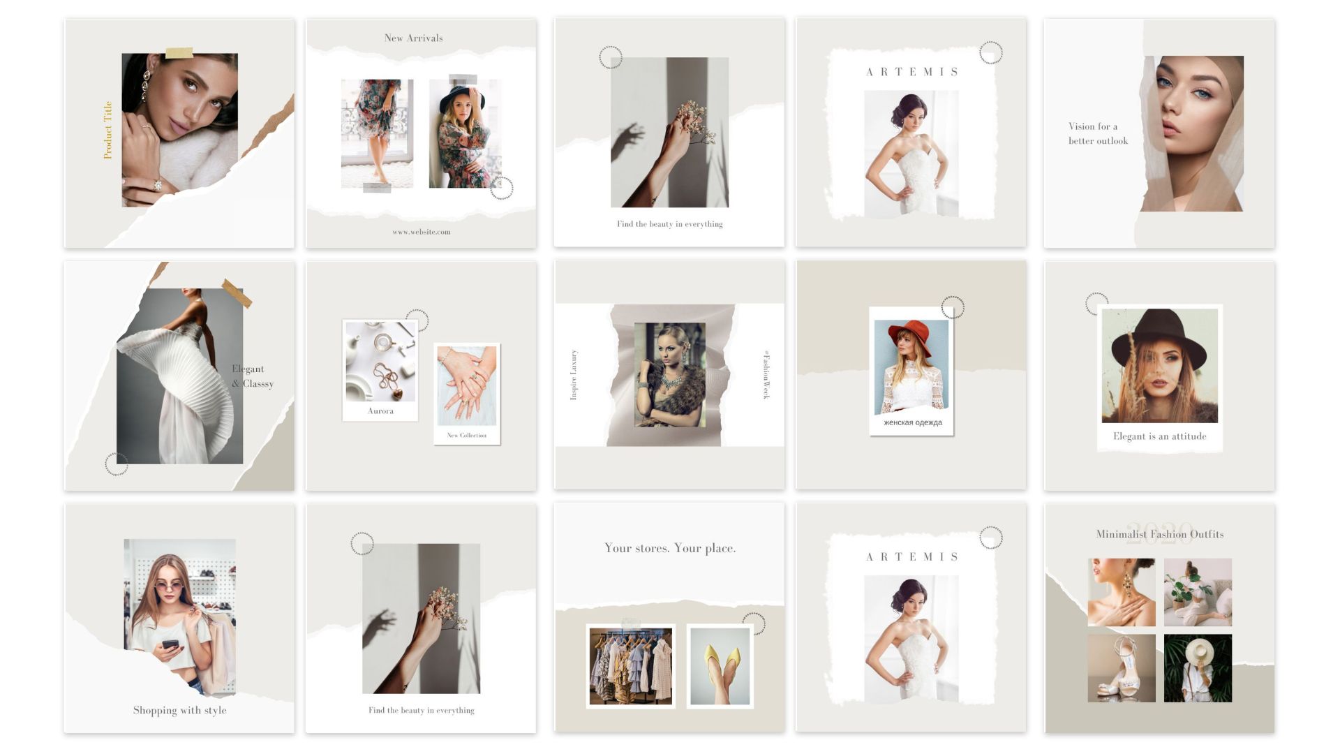
For carousels, I like this structure:
- Slide 1: Big headline + simple visual
- Slide 2–4: Point-by-point explanation (minimal text)
- Last slide: CTA – “Follow for more tips”, “Visit website”, etc.
The goal is not to show how many effects I can use, but how clearly I can tell the message.
8. My Simple Workflow (How I Actually Design)
To make this practical, here’s my real-world design workflow:
- Clarify the purpose & message
- “This post promotes my new cybersecurity service”
- Main message: “Secure your online life in one session.”
- Write the text
- Headline: “Secure Your Online Life in 1 Session”
- Subline: “Personal cybersecurity help for creators & normal users.”
- CTA: “Learn more” or website URL.
- Choose format & size
- Instagram square (1080×1080)
- Story, Reel cover, LinkedIn post, etc.
- Set background & grid
- Choose background color (often white or very light)
- Set margins (safe zones)
- Place the headline first
- Make it big and readable.
- Center or align left (I usually prefer left for more “professional” feel).
- Add supporting elements
- Subtext below headline
- CTA button or small banner
- Small brand logo, website, or handle
- Add visual
- Icon, simple illustration, or image that supports the context
- Keep it on one side, don’t let it fight with the text.
- Adjust spacing & balance
- Check if there is enough white space
- Make sure text isn’t too close to edges
- Test on phone
- I always imagine: “Will this be readable on a small screen?”
- If not, I make fonts larger and cut text.
9. Common Mistakes I See (And Avoid Now)
From years of designing for myself and clients since 2018, I keep seeing the same mistakes:
- Too much text – looks like a mini essay, not a social post
- Too many ideas in one post – pick 1 main point
- No hierarchy – everything same size, same weight
- Too many colors and fonts – looks chaotic
- Tiny text – unreadable on mobile
- No alignment – elements randomly placed
- No margins – text touching the edges
Whenever my design feels “off”, I check myself against these mistakes and usually find the reason there.
10. Final Thoughts: Clean Design Is a Choice, Not a Talent
People often think you need to be “naturally creative” to design good social media posts.
But from my own journey (starting as a curious school kid in 2012, doing side projects during my bachelor’s, and freelancing professionally since 2018), I’ve learned:
Clean and professional design is more about discipline than talent.
- Saying no to extra elements
- Limiting your colors and fonts
- Respecting white space
- Thinking about the message first
If you apply these ideas, your posts will already look better than 90% of random content on social media.